
AutoDash — The Lovable of Data Apps
Make beautiful dashboards instantly using autodash

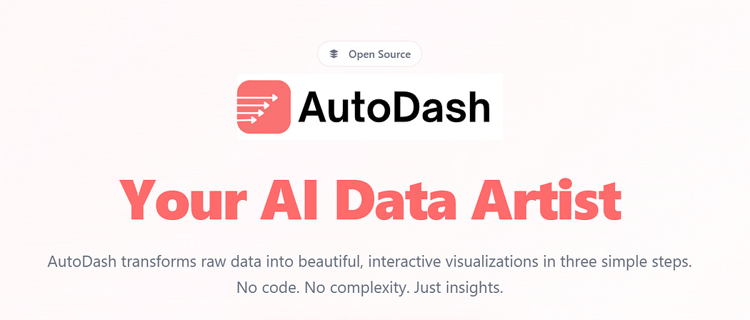
We’re excited to introduce AutoDash, the lovable way to build beautiful data apps in seconds. While growing our previous AI data-science SaaS, we noticed a clear pattern: many users weren’t looking for another heavy analytics platform.
They wanted something fast, simple, and optimized specifically for Plotly dashboards. AutoDash is our answer, a streamlined, intuitive tool that lets anyone turn data into stunning, interactive dashboards instantly.
You can access the site here:
Feature Overview
In order to reduce complexity, the system creates a complete interactive analytics dashboard in just three steps:
Step 1: Connecting your data
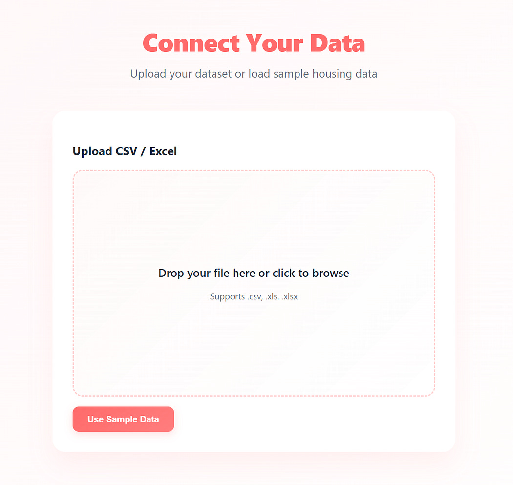
Upload a csv or excel-sheets (tabular data only for now)
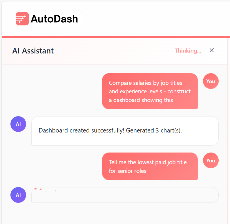
Step 2: Ask the AI to answer a specific analytics question
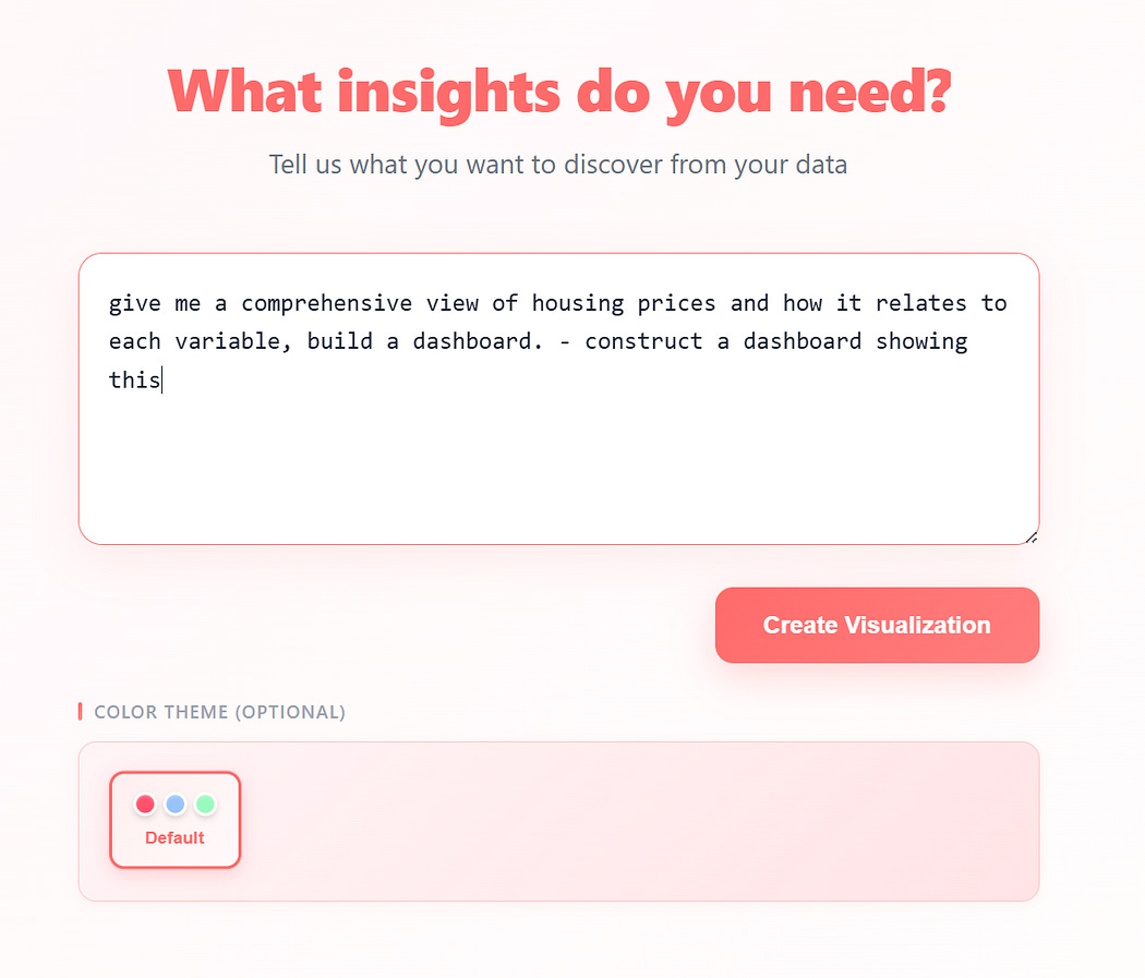
A text box you can tell what insights you want in the dashboard/data app
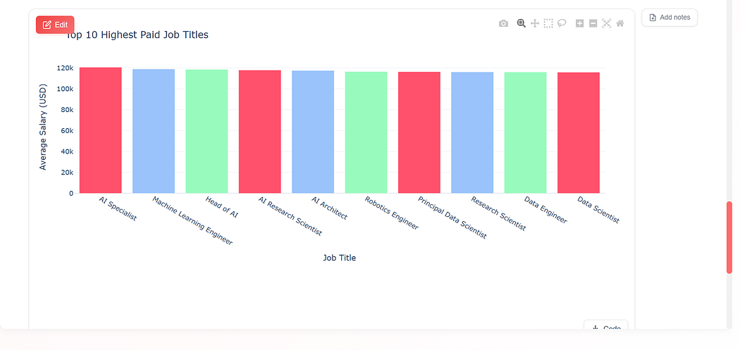
3. Generate Insights
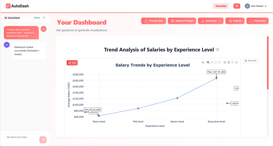
Instant Insights
4. Edit & Add Charts
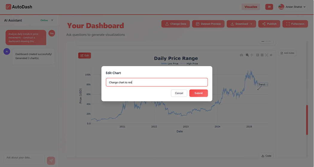
You can edit charts using the chat or edit button
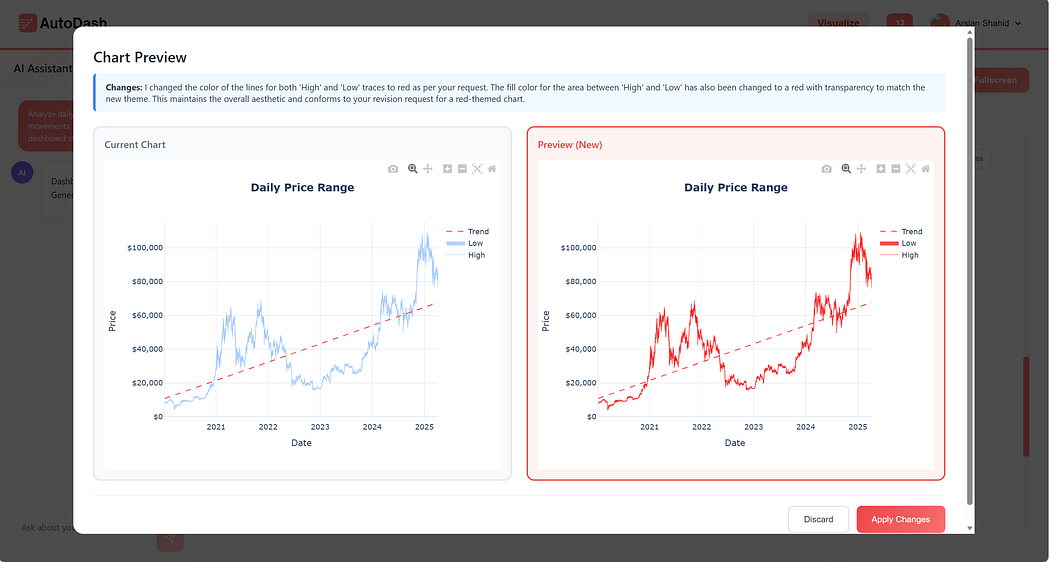
Applying the results
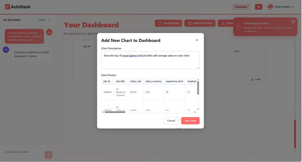
Add Chart, either through chat or + button
Newly added chart
Get 40% off from autodash.art
Using this promocode at checkout: SUBSTACK
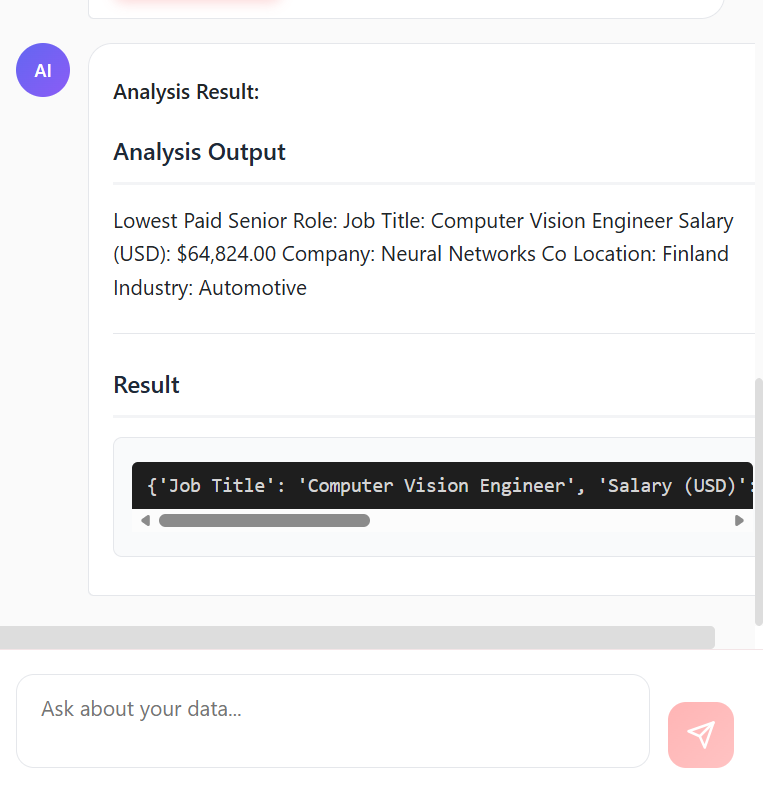
5. Do Analysis
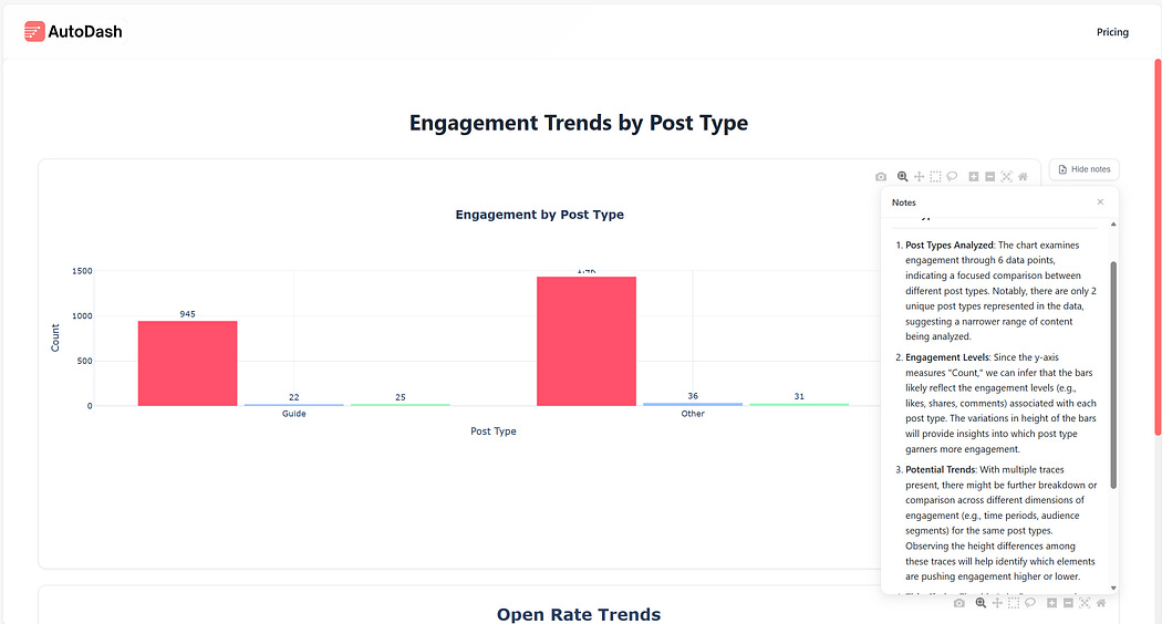
5. Add notes to highlight important information
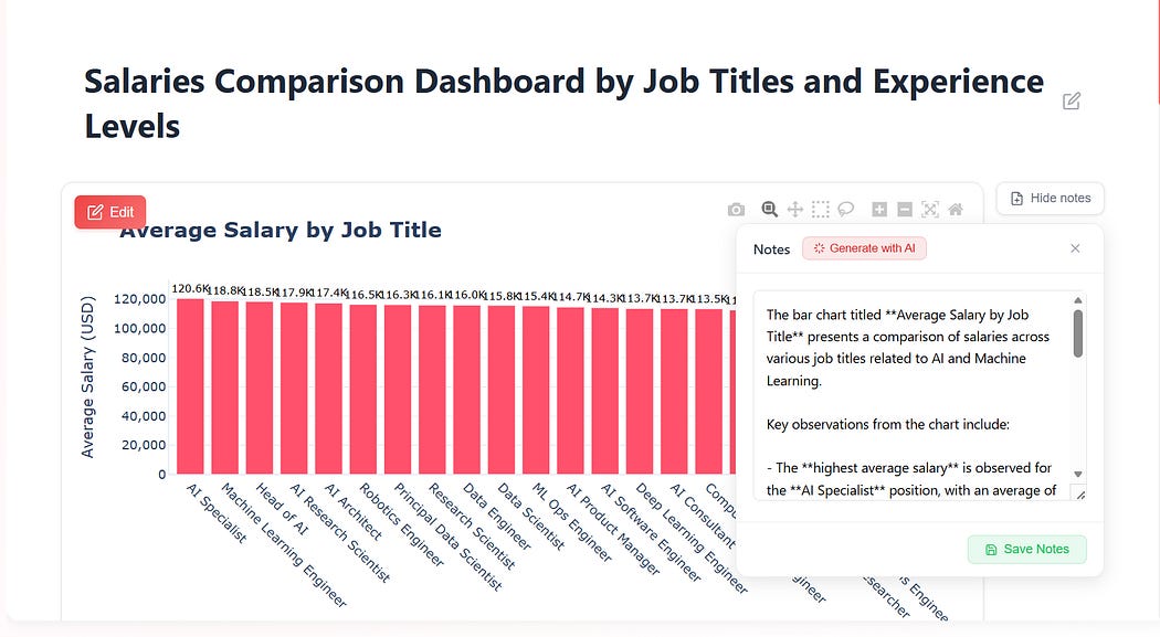
Notes to share your dashboard with colleagues and even the world
6. Publish to the world
You can easily host the dashboard for up to 24 hours for the free version & forever for the paid version
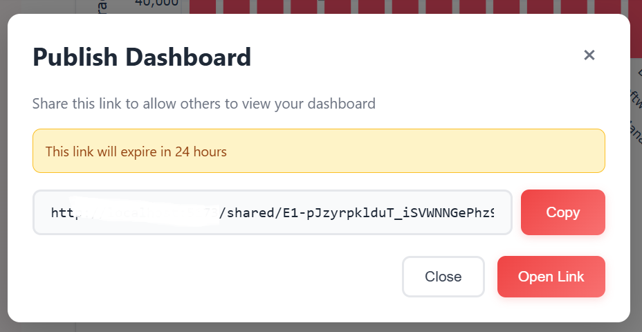
Shareable link available for 24 hours on the free tier & forever on the paid tier
Share your dashboard/insights with the world
Enjoy generating insights using our tool. We also provide specialized services for AI software solutions.
Have a use-case or product you want to build?
You can reach out here: https://tally.so/r/3x9bgo
Thank you for reading!