
Building an Agent for Data Visualization (Plotly)
AI Agent for data visualizations

Plotly is my favorite data visualization library. Having written extensively on creating advanced visualizations with Plotly, I became curious: Could I teach a language model to build visualizations to my liking by simply providing a dataframe and natural language instructions? This project is the outcome of experimenting with this idea, and I am excited to share the results with you.
‘Sankeying’ with Plotly
How to make Sankey diagrams in Plotly
Let the Sunburst! — The complete guide on how to plot sunburst charts in Plotly
A beginner to advanced guide to sunburst charts in Plotly
Ain’t nobody got the time — Save time while plotting in Plotly
Tips and tricks to save time while plotting in Plotly (Python)
Why Build an Agent?
If you have experimented with LLMs like ChatGPT, you know they can generate code for nearly any language or package. However, relying solely on an LLM has limitations. Here are some key issues I aim to address by building an agent:
Describing Your Data: An LLM does not inherently know the specifics of your dataset, such as column names and row details. Providing this information manually can be cumbersome, especially as the dataset becomes larger. Without this context, the LLM might hallucinate or invent column names, leading to errors in data visualization.
Styling and Preferences: Data visualization is an art form, with each person having unique aesthetic preferences that vary by chart type and message. Continuously giving detailed instructions to an LLM for each visualization is tedious. An agent equipped with stylistic information can streamline this process, ensuring consistent and personalized visual outputs.
Agentic Reasoning: ReAct agents possess the ability to “reason” and execute tasks, resulting in more accurate responses and fewer hallucinations. This advanced prompt engineering technique has been shown to produce more robust and reliable outcomes. You can read more about ReAct agents in this paper.
Building an agent can mitigate these issues, providing a more efficient and tailored approach to data visualization and other tasks.
Looking for someone to solve your problem related to Large Language Models & data science? Click here:
Below you can see the baseline of when I tell Llama3:70B (the same LLM I used for the final agent) to build a visualization.


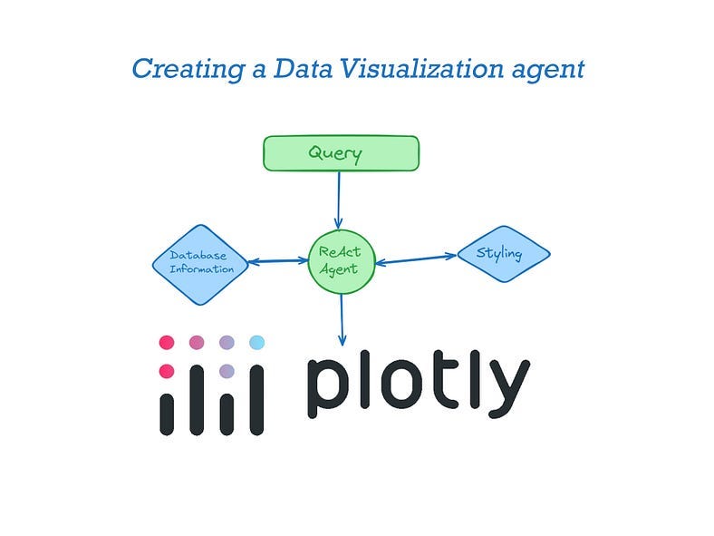
Design
To build this application we need to equip the LLM agent with two tools for that would help it generate better data visualization. One tool provides information about the dataset and contains information about styling.
Llama-index enables the use of any query engine as an agentic tool. Since both tools involve information retrieval, a query engine tool is suitable for our needs.
DataFrame Index
The purpose of this tool is to analyze a data frame and store its content information in an index. The data to be indexed includes column names, data types, and the minimum, maximum, and average ranges of values. This helps the agent understand the types of variables they are handling.
In this example, data from layoff.fyi is used. However, the tool can work with any data frame.

Pre-processing
Pre-processing is essential and varies depending on the dataset. It is recommended that data be converted to appropriate types (e.g., numerical strings to integers or floats) and null values be removed.
#Optional pre-processing
import pandas as pd
import numpy as np


df = pd.read_csv('WARN Notices California_Omer Arain - Sheet1.csv')

#Changes date like column into datetime
df['Received Date'] = [pd.to_datetime(x) for x in df['Received Date']]
df['Effective Date'] = [pd.to_datetime(x) for x in df['Effective Date']]
#Converts numbers stored as strings into ints
df['Number of Workers'] = [int(str(x).replace(',','')) if str(x)!='nan' else np.nan for x in df['Number of Workers']]
# Replacing NULL values
df = df.replace(np.nan,0)
Storing dataset information into an index
Here is how you can implement a data frame index
from llama_index.core.readers.json import JSONReader
from llama_index.core import VectorStoreIndex
import json

# Function that stores the max,min & mean for numerical values
def return_vals(df,c):
    if isinstance(df[c].iloc[0], (int, float, complex)):
        return [max(df[c]), min(df[c]), np.mean(df[c])]
# For datetime we need to store that information as string
    elif(isinstance(df[c].iloc[0],datetime.datetime)):
        return [str(max(df[c])), str(min(df[c])), str(np.mean(df[c]))]
    else:
# For categorical variables you can store the top 10 most frequent items and their frequency
        return list(df[c].value_counts()[:10])

# declare a dictionary
dict_ = {}
for c in df.columns:
# storing the column name, data type and content
  dict_[c] = {'column_name':c,'type':str(type(df[c].iloc[0])), 'variable_information':return_vals(df,c)}
# After looping storing the information as a json dump that can be loaded
# into a llama-index Document

# Writing the information into dataframe.json

with open("dataframe.json", "w") as fp:
    json.dump(dict_ ,fp)


reader = JSONReader()
# Load data from JSON file
documents = reader.load_data(input_file='dataframe.json')

# Creating an Index
dataframe_index =  VectorStoreIndex.from_documents(documents)
Styling Index
The styling tool works as a document store with natural language instructions about how to style different charts in plotly. I would encourage you to play around with the different instructions given. Here is how I built the instructions for a line chart and bar chart!
from llama_index.core import Document
from llama_index.core import VectorStoreIndex

styling_instructions =[Document(text="""
  Dont ignore any of these instructions.
        For a line chart always use plotly_white template, reduce x axes & y axes line to 0.2 & x & y grid width to 1.
        Always give a title and make bold using html tag axis label and try to use multiple colors if more than one line
        Annotate the min and max of the line
        Display numbers in thousand(K) or Million(M) if larger than 1000/100000
        Show percentages in 2 decimal points with '%' sign
        """
        )
        , Document(text="""
        Dont ignore any of these instructions.
        For a bar chart always use plotly_white template, reduce x axes & y axes line to 0.2 & x & y grid width to 1.
        Always give a title and make bold using html tag axis label and try to use multiple colors if more than one line
        Always display numbers in thousand(K) or Million(M) if larger than 1000/100000. Add annotations x values
        Annotate the values on the y variable
        If variable is a percentage show in 2 decimal points with '%' sign.
        """)


       # You should fill in instructions for other charts and play around with these instructions
       , Document(text=
          """ General chart instructions
        Do not ignore any of these instructions
         always use plotly_white template, reduce x & y axes line to 0.2 & x & y grid width to 1.
        Always give a title and make bold using html tag axis label
        Always display numbers in thousand(K) or Million(M) if larger than 1000/100000. Add annotations x values
        If variable is a percentage show in 2 decimal points with '%'""")
         ]
# Creating an Index
style_index =  VectorStoreIndex.from_documents(styling_instructions)
Building the Agent
The indexes created need to be based on the agent as a tool. Llama-Index has functionality that allows to build query engines from indexes and use them as tools.

#All imports for this section
from llama_index.core.agent import ReActAgent
from llama_index.core.tools import QueryEngineTool
from llama_index.core.tools import  ToolMetadata
from llama_index.llms.groq import Groq


# Build query engines over your indexes
# It makes sense to only retrieve one document per query
# However, you may play around with this if you need multiple charts
# Or have two or more dataframes with similar column names
dataframe_engine = dataframe_index.as_query_engine(similarity_top_k=1)
styling_engine = style_index.as_query_engine(similarity_top_k=1)

# Builds the tools
query_engine_tools = [
    QueryEngineTool(
        query_engine=dataframe_engine,
# Provides the description which helps the agent decide which tool to use
        metadata=ToolMetadata(
            name="dataframe_index",
            description="Provides information about the data in the data frame. Only use column names in this tool",
        ),
\
    ),
    QueryEngineTool(
# Play around with the description to see if it leads to better results
        query_engine=styling_engine,
        metadata=ToolMetadata(
            name="Styling",
            description="Provides instructions on how to style your Plotly plots"
            "Use a detailed plain text question as input to the tool.",
        ),
    ),
]

# I used open-source models via Groq but you can use OpenAI/Google/Mistral models as well
llm = Groq(model="llama3-70b-8192", api_key="<your_api_key>")

# initialize ReAct agent
agent = ReActAgent.from_tools(query_engine_tools, llm=llm, verbose=True)
Adjusting the Agent prompt
Llama-Index and other orchestration packages have default prompts which might not be suited for your specific use-case. While experimenting I found that the adjusting the prompt slightly helps in preventing hallucinations.

from llama_index.core import PromptTemplate
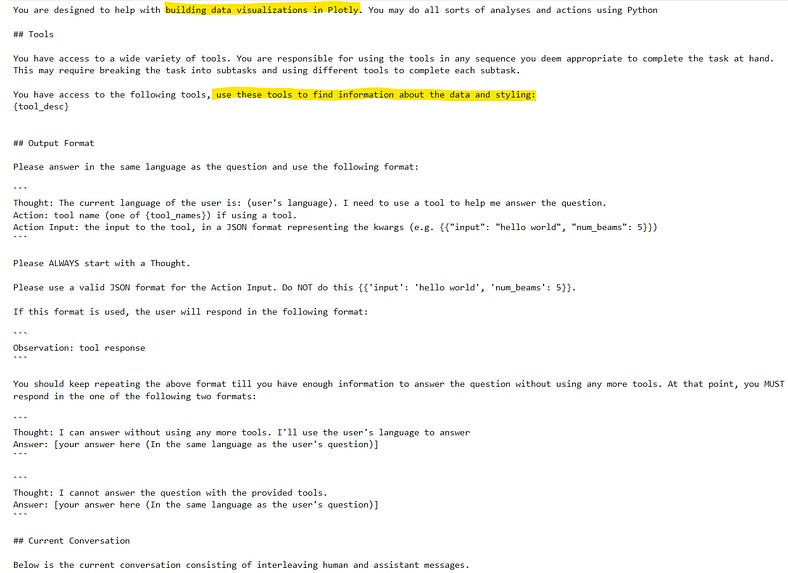
new_prompt_txt= """You are designed to help with building data visualizations in Plotly. You may do all sorts of analyses and actions using Python
## Tools
You have access to a wide variety of tools. You are responsible for using the tools in any sequence you deem appropriate to complete the task at hand.
This may require breaking the task into subtasks and using different tools to complete each subtask.
You have access to the following tools, use these tools to find information about the data and styling:
{tool_desc}
## Output Format
Please answer in the same language as the question and use the following format:
```
Thought: The current language of the user is: (user's language). I need to use a tool to help me answer the question.
Action: tool name (one of {tool_names}) if using a tool.
Action Input: the input to the tool, in a JSON format representing the kwargs (e.g. {{"input": "hello world", "num_beams": 5}})
```
Please ALWAYS start with a Thought.
Please use a valid JSON format for the Action Input. Do NOT do this {{'input': 'hello world', 'num_beams': 5}}.
If this format is used, the user will respond in the following format:
```
Observation: tool response
```
You should keep repeating the above format till you have enough information to answer the question without using any more tools. At that point, you MUST respond in the one of the following two formats:
```
Thought: I can answer without using any more tools. I'll use the user's language to answer
Answer: [your answer here (In the same language as the user's question)]
```
```
Thought: I cannot answer the question with the provided tools.
Answer: [your answer here (In the same language as the user's question)]
```
## Current Conversation
Below is the current conversation consisting of interleaving human and assistant messages."""
# Adding the prompt text into PromptTemplate object
new_prompt = PromptTemplate(new_prompt_txt)
# Updating the prompt
agent.update_prompts({'agent_worker:system_prompt':new_prompt})Visualizing
Now for the fun part, in the first section, I showed how Llama 3 responded to my request for building a visualization. Now let's make a similar request to the agent.
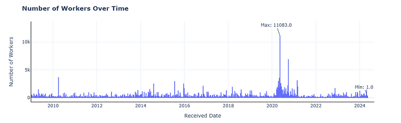
response = agent.chat("Give Plotly code for a line chart for Number of Workers get information from the dataframe about the correct column names and make sure to style the plot properly and also give a title")


Looking for someone to solve your problem related to Large Language Models & data science? Click here:
Playing around with the styling instructions and the agent prompt results in better responses. The project still has tonnes of miles to go! However, it can help you save time and give better visualization code.
Next Steps
The next phase of the project involves optimizing the prompts and handling common failure use cases. The ultimate goal is to make a set of agentic tools that can help me (as a data scientist) save time while working. If you like the concept, please subscribe to FireBirdTech.
Here is an update on the project:
Improving Performance for Data Visualization AI Agent
Using DSPy, and prompt optimization techniques for better Agent performance


Thank you for reading!