
Data Visualization is art. Create like a data artist
Turn data into insight, beautifully — autodash

After testing our product Autodash — AI Data Apps, we discovered that most users aren’t just looking for standard dashboards. They want to personalize the experience deeply, treating data visualization as a form of art. Listening to their interests, we’ve added features designed to help them become true data artists, turning insights into visually stunning, highly customized creations.
Watch the video version of this post, made using https://blog2video.app:
Data visualization is an art form. We built a product that turns you into the data artist. Try it here:
Design Features
This blog post will walk through all the design features we introduced into the product.
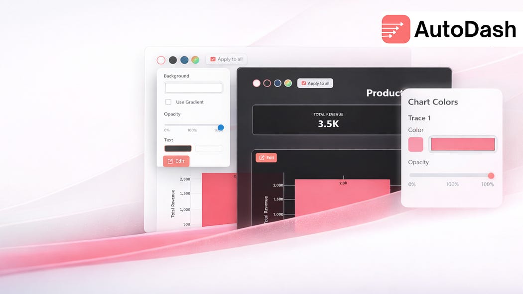
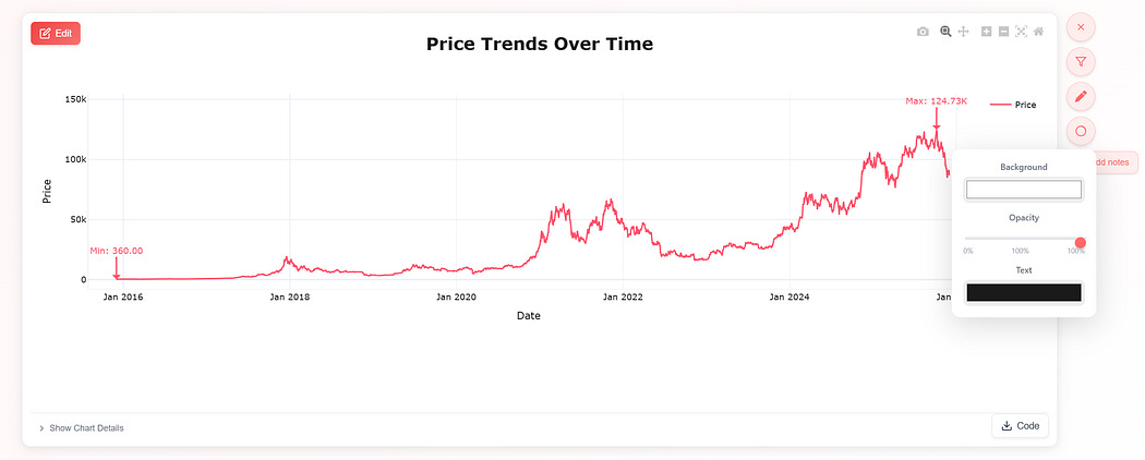
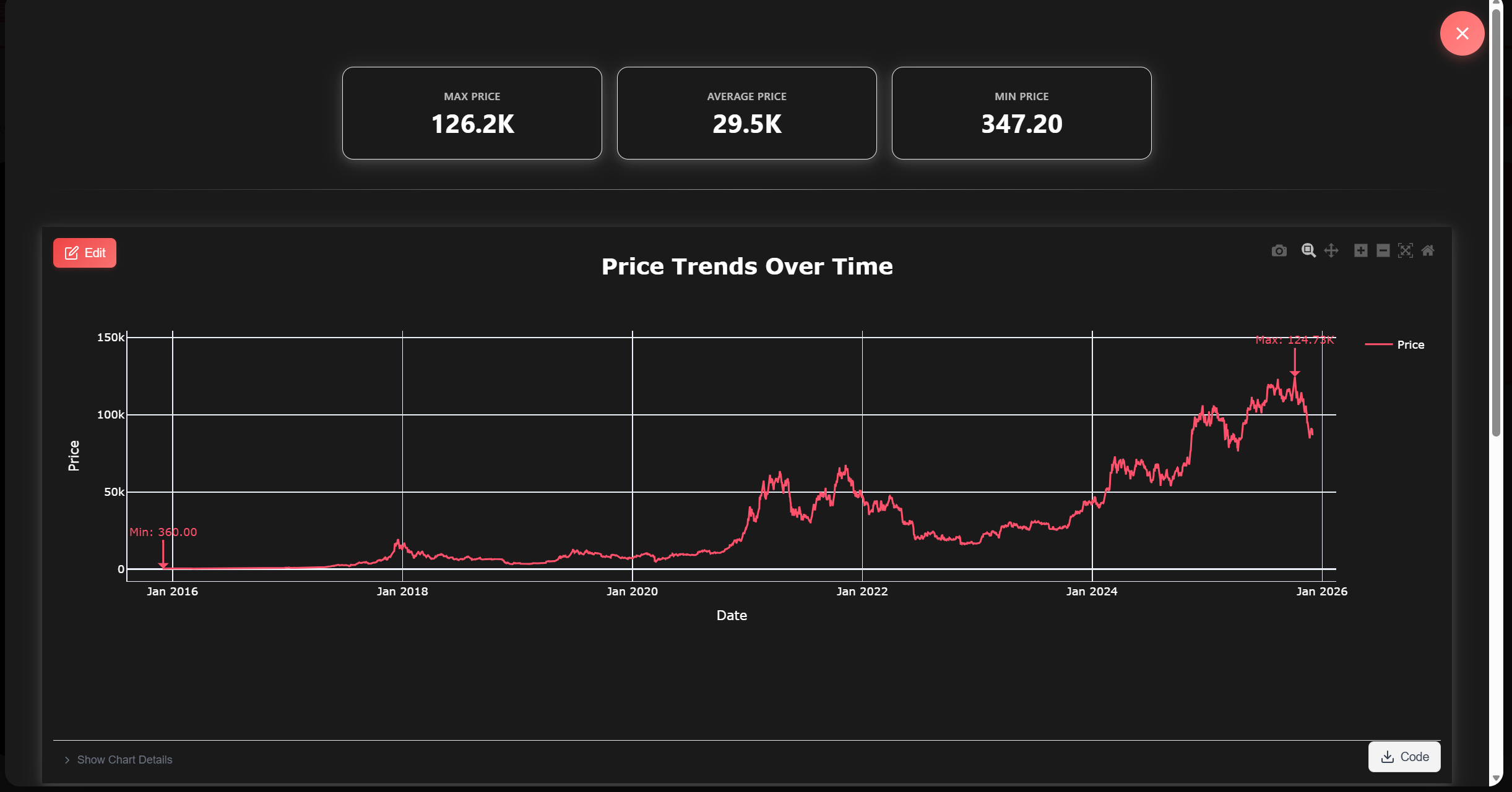
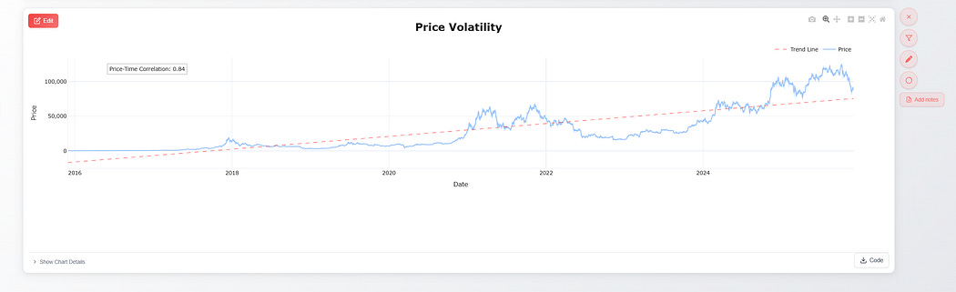
Now users can change trace/line/bar/component colors directly, instead of asking it to regenerate the chart with a different color
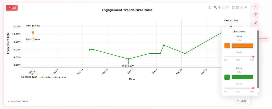
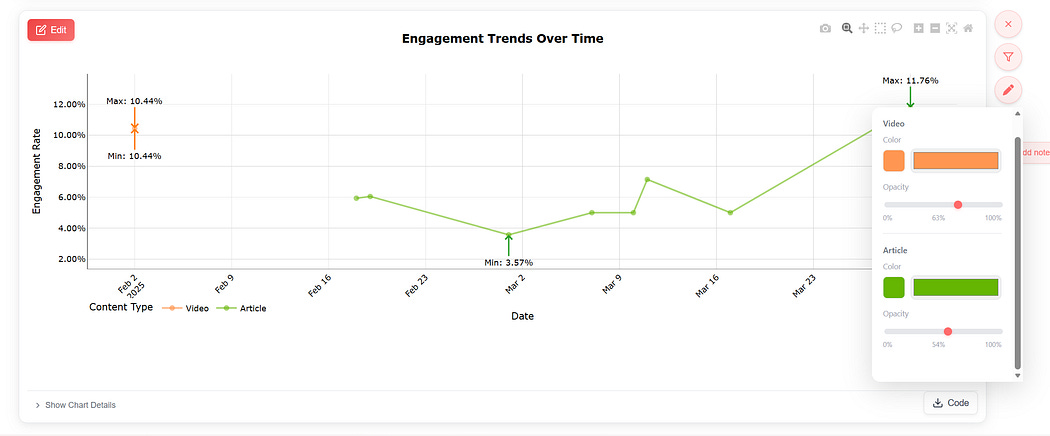
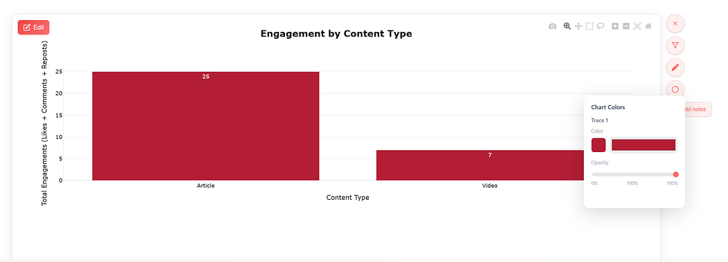
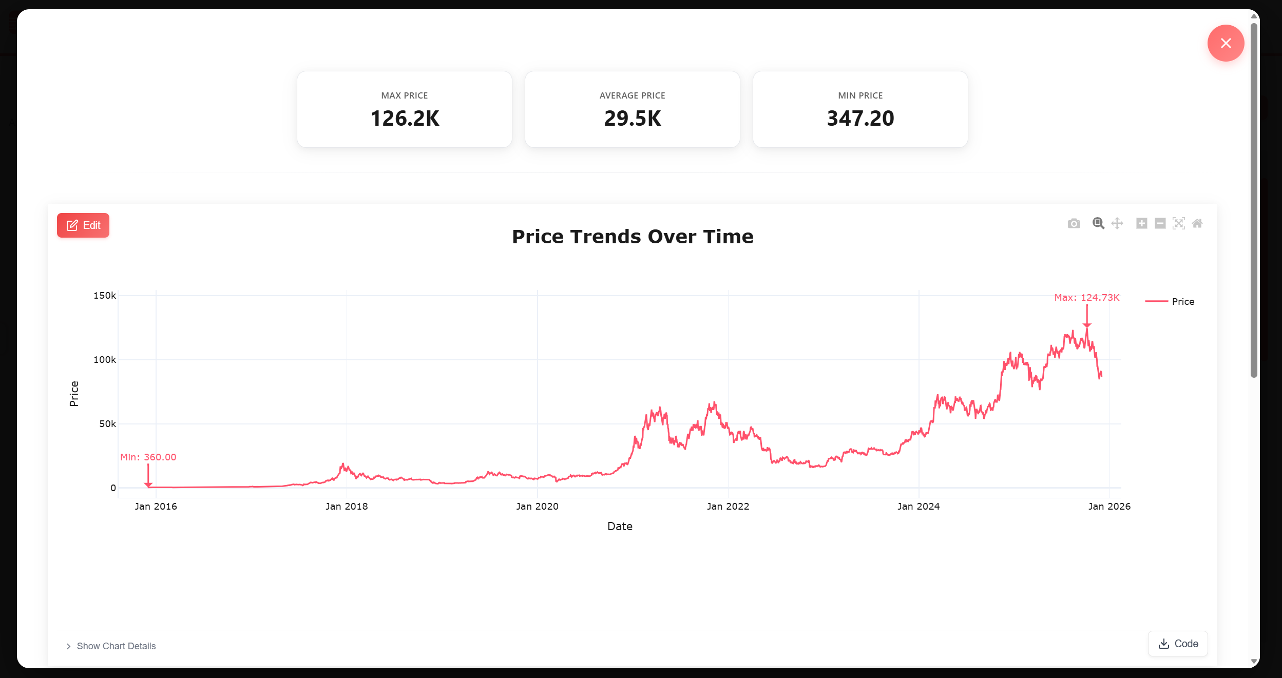
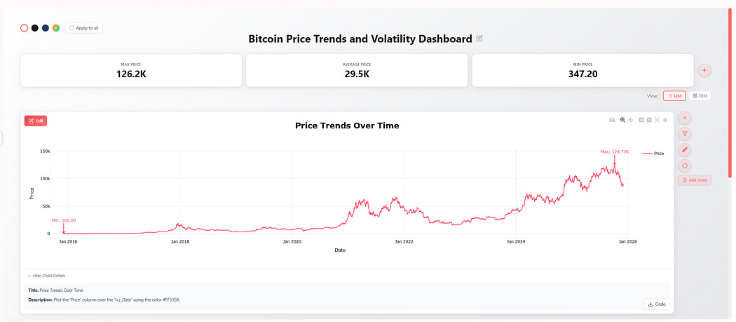
The system auto-detects components generated in the visualization
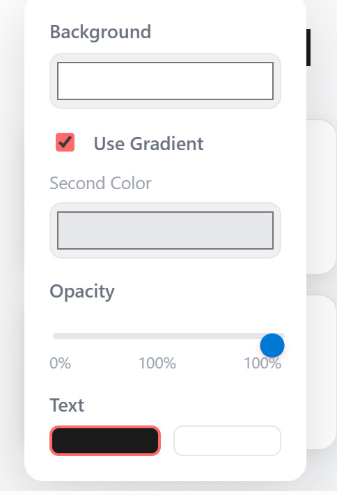
Now users can change the chart/kpi card/text background and opacity as well; without regeneration or consuming credits
Pre-Image
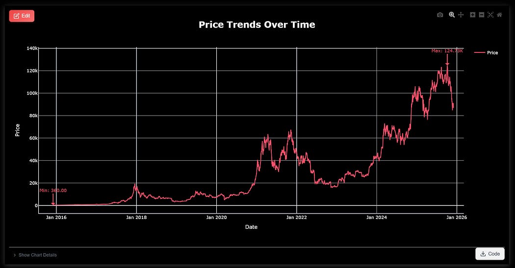


User can also select a color for the dashboard as a whole, change opacity and also apply a two-color gradient
Pre and Post of entire dashboard background color change
We also develop custom AI SaaS products. We have done engagements with $Bn companies & early stage start-ups.
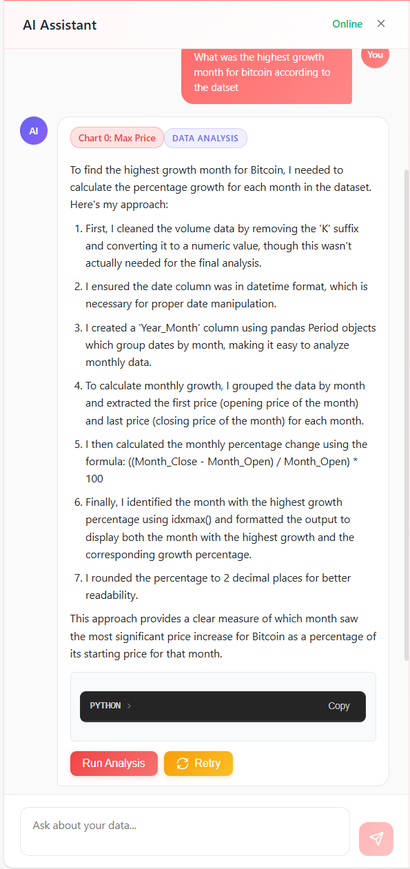
All of this combined with power AI data analytics abilities that help you get answer’s fast, uses Python’s data science libraries to find answers.
Design Features in pipeline
Preference Memory: We are internally testing a color and visual aesthetics-based memory system that will learn automatically what kind of colors/themes/charts you prefer
Themes: Every artist needs inspiration. We will give many professionally built visualization designs that will help users build amazing visualizations fast.
Fonts/Misc edit capability: Currently only main chart components are editable without regenerating the chart. We will give users the ability to change fonts, gridlines, and other misc. elements.
Analytics features in pipeline
Analytics Mode: A dedicated jupyter notebook like interface that allows users to build analytics pipelines quickly and easily.
Connectors: At the moment core support is for excel sheets and CSV. With SQL connectors available upon request. We plan to add all baseline data connectors to the system.
Thank you for reading. Autodash is the perfect tool for analytics done beautifully.