
‘Sankeying’ with Plotly
How to make Sankey diagrams in Plotly

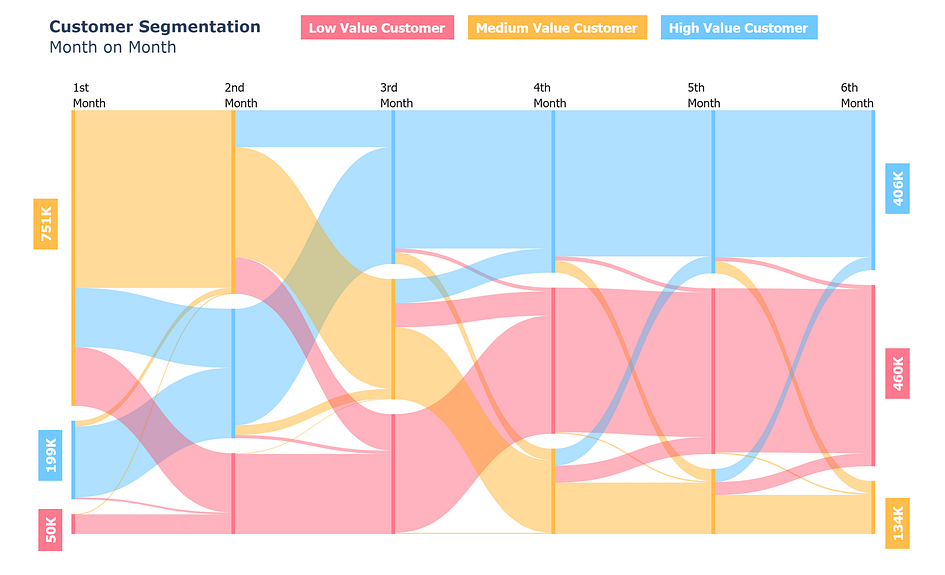
Sankey diagrams are used to visualize flow or processes, as the above image shows how many transitions/flow between different customer segments. The specific business problem was to see in 6 months which customer segment is growing, or shrinking and how are customers switching month on month. There are three customer segments low value (red), medium value (yellow), and high value (blue). This particular visualization helps see segment-wise growth, shrinkage, and transitions.
Examples of customer segmentation are widespread but Sankey diagrams could be used to visualize much more. Common business analytics use cases (by no means exhaustive) include:
Customer Journey: Customer journeys detail how the customer interacts with a product. Sankey diagrams can be used to visualize the whole journey for example visualizing how the customer interacts with your mobile application, which menus they visit, which buttons they click, and which channels they use for purchases.
Customer Lifecycle: Seeing customer behavior from first purchase to churn can help identify problems with retention/growth. You could also use it to see how customer lifetime value evolves.
A/B Testing: Visualizing how a particular experiment between different features changes customer metrics.
Product Recommendations: Detailing the performance of a product recommendation system or algorithm, and how different recommendations are performing based on business KPIs.
It is easy to see how Sankey diagrams are useful. The first step to learning anything is to get the basics working, then abstract and generalize to solve more complex problems.
Looking for someone to solve your problem? Click here:
How to Sankey - Basic
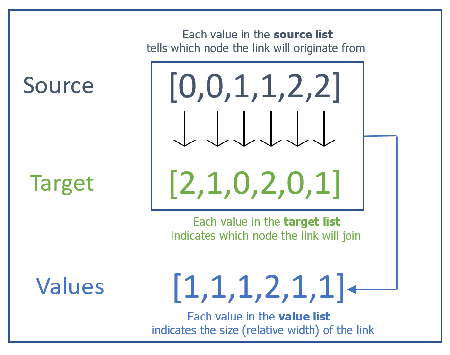
To understand how to implement first construct a simple Sankey. With three nodes and 6 links. In Plotly Sankeys are defined by three lists, if you can configure them properly, most of your work is done.

The three lists are source, target, and values. Plotly indexes each node using a number starting from 0 to the total number of nodes minus one. The source and target list define a link between nodes. To understand better let us look at the code:
#Importing the plotly graph object library
import plotly.graph_objects as go
#Creating the Sankey figure
fig = go.Figure(data=[go.Sankey(
#Basic styling options
node = dict(
pad = 15,
thickness = 20,#Tells the width of the node
line = dict(color = “black”, width = 0.5),#Node border settings#(width & color)
color = “blue”#Node color
),
#Main attributes are the lists, if you have these figured out you #can make a Sankey.
link = dict(
source = [0,0,1,1,2,2],#Contains info of origin of link
target = [2, 1,0,2,0,1],#Contains info about which link to join
value = [1,1,1,2,1,1]#Contains relative sizes(width) of links
))])
#Adding a title & showing the figure (Optional)
fig.update_layout(title_text=”Basic Sankey Diagram”, font_size=10)
fig.show()
I would highly encourage you to try different configurations manually to figure out how the diagram would change. Try adding more nodes and more intricate links etc.
The hardest part is configuring these three lists, other than that you just have to style your Sankey to make it look fancy. For small Sankeys configuring these lists can be done manually but it is hard to do when you have say 30 nodes and 100+ links. You often have to deal with customer-level data sets with multiple groups and categories to link. In the next section, we would start building our Sankey using simulated data of 1 million customers (link to the dataset).
Quickly make your own website:
How to Sankey — Advanced
1. Data Wrangling
Starting from building the data for the visualization you’ll need basic knowledge of pandas, or other data manipulation libraries. Nothing too complicated, basic knowledge of groupby, lists, and dictionaries would suffice.
We will start by defining our end goal since there are three categories of customers (low, medium, and high value) and 6 months, which translates into 3 x 6 = 18 nodes. In our problem, our customer can switch segments month on month. Going from every category to every category is technically possible which makes a total of 3 x 3 = 9 links every month or a total possible of 6 x 9 = 54 links in the entire diagram. First, we have to groupby every month and then create aggregates month by month (first month with the second month, the second month with the third month, and so on).
#groups has all the combinations of 6 months
groups = df.groupby([‘First Month’,’Second Month’,’Third Month’,’Fourth Month’,’Fifth Month’,’Sixth Month’]).agg({‘Customer_id’:’count’}).reset_index()
#first_month has all the combinations of 1st Month with 2nd Month
first_month = groups.groupby([‘First Month’,’Second Month’]).agg({‘Customer_id’:’sum’}).rename({‘Customer_id’:’counts’}).reset_index()
#second_month has all the combinations of 2nd Month with 3rd Monthsecond_month = groups.groupby([‘Second Month’,’Third Month’]).agg({‘Customer_id’:’sum’}).rename({‘Customer_id’:’counts’}).reset_index()
#third_month has all the combinations of 3rd Month with 4th Monththird_month = groups.groupby([‘Third Month’,’Fourth Month’]).agg({‘Customer_id’:’sum’}).rename({‘Customer_id’:’counts’}).reset_index()
#fourth_month has all the combinations of 4th Month with 5th Monthfourth_month = groups.groupby([‘Fourth Month’,’Fifth Month’]).agg({‘Customer_id’:’sum’}).rename({‘Customer_id’:’counts’}).reset_index()
#fifth_month has all the combinations of 5th Month with 6th Monthfifth_month = groups.groupby([‘Fifth Month’,’Sixth Month’]).agg({‘Customer_id’:’sum’}).rename({‘Customer_id’:’counts’}).reset_index()
#list_ contains all these dataframeslist_=[first_month,second_month,third_month,fourth_month,fifth_month]There are plenty of ways to do this but I prefer to create lists and dictionaries which ultimately define our three lists (source,target, and value).
#names contains all the labels of our nodes. We will add suffix #'_M1,_M2,_M3....' to our segmentation to differntiate one months #segement with other months,i.e LOW VALUE CUSTOMER_M3 tells Low #value customer in 3rd month. names = []
count_dict = {} #will contain all info of value list
source_list = [] #will contain all info of source
target_list = [] #will contain all info of targetfor i in range(0, len(list_)):
cols =list_[i].columns # contains columns for our dataframe
#(list_[i])
#This for loop is inside the outer loop
for x,y,z in zip(list_[i][cols[0]],list_[i][cols[1]],list_[i][cols[2]]):#Iterates over x(source),y(target),z(counts)
if(x+'_M'+str(i+1) not in names):
names.append(x+'_M'+str(i+1))#appends in names#the next line is outside the if but inside the second loop count_dict[x+'_M'+str(i+1),y+'_M'+str(i+2)] =z
source_list.append(x+'_M'+str(i+1))
target_list.append(y+'_M'+str(i+2))#Now we add labels into name for the last month targets
for v in target_list:
if v not in names:
names.append(v)
The above code snippet is complicated, but essentially what it does is maintain a names list with all the nodes labels, a source_list with all the source labels, target_list with all the target labels, and a count_dict which stores how much value does each source, target pair have.
Notice: Plotly requires indexes (0,1,2…) in the three lists, not labels but I stored the labels not indexed value in these lists because that way you can easily see if you have made an incorrect combination. if I began with indexes instead of labels it will be harder to debug. Now the next step is to assign a numeric value to each label.
#all_numerics contains the index for every label
all_numerics = {}
for i in range(0,len(names)):
    all_numerics[names[i]] = i
If you implemented this correctly you will have 5 things:
names: a list of all labels in source & target
source_list: a list of all source labels.
target_list: a list of all target labels
count_dict: a dictionary of all the counts, with two keys one for the source and one for the target.
all_numerics: a dictionary of an index value assigned to a label.
2. Plotting
fig = go.Figure(data=[go.Sankey(
 node = dict(
 thickness = 5,
 color =’blue’,
 ),
 link = dict(
#use all_numerics to transform labels to index
source = [all_numerics[x] for x in source_list],
target = [all_numerics[x] for x in target_list],
#Use count_dict to get value for each link
value = [count_dict[x,y] for x,y in zip(source_list,target_list)],
),)])
#Adding title, size, margin etc (Optional)
fig.update_layout(title_text="<b>Customer Segmentation</b><br>Month on Month", font_size=15,width=1200,height=800, margin=dict(t=210,l=90,b=20,r=30))
fig.show()
3. Styling & Annotations
We need to be able to differentiate between our different segments. For this essentially we will use a different color for each category.
#define two sets of color dictionaries one for the nodes and the #other for the links#Node color dict, RGBA means red,green,blue,alpha. Alpha sets the #opacity/transperancy
color_dict = {'LOW VALUE CUSTOMER':' rgba(252,65,94,0.7)','MEDIUM VALUE CUSTOMER':'rgba(255,162,0,0.7)','HIGH VALUE CUSTOMER':'rgba(55,178,255,0.7)'}#link color dict.The colors are the same but lower a value, lower #opacity. Gives a nice effect.color_dict_link = {'LOW VALUE CUSTOMER':' rgba(252,65,94,0.4)','MEDIUM VALUE CUSTOMER':'rgba(255,162,0,0.4)','HIGH VALUE CUSTOMER':'rgba(55,178,255,0.4)'}#Plotting, everything is the same as last with added colorsfig = go.Figure(data=[go.Sankey(
node = dict(
thickness = 5,
line = dict(color = None, width = 0.01),
#Adding node colors,have to split to remove the added suffix
color = [color_dict[x.split('_')[0]] for x in names],),
link = dict(
source = [all_numerics[x] for x in source_list],
target = [all_numerics[x] for x in target_list],
value = [count_dict[x,y] for x,y in zip(source_list,target_list)],
#Adding link colors,have to split to remove the added suffix
color = [color_dict_link[x.split('_')[0]] for x in target_list]
),)])Lastly, to add annotations, you can use the add_annotations command or pass labels into the node dict while plotting in plotly. However, I prefer to annotate using PowerPoint or an image editor because add_annotations is tricky to use as you’ll need precise values for each annotation. The add labels method has a styling problem, you can’t change the color for every label. It only allows for one default setting for all labels. Nonetheless, here is the code for adding annotations.
#Adds 1st,2nd month on top,x_coordinate is 0 - 5 integers,column #name is specified by the list we passed
for x_coordinate, column_name in enumerate(["1st<br>Month","2nd<br>Month","3rd<br>Month","4th<br>Month",'5th<br>Month','6th<br>Month']):
    fig.add_annotation(
          x=x_coordinate,#Plotly recognizes 0-5 to be the x range.

          y=1.075,#y value above 1 means above all nodes
          xref="x",
          yref="paper",
          text=column_name,#Text
          showarrow=False,
          font=dict(
              family="Tahoma",
              size=16,
              color="black"
              ),
          align="left",
          )
#Adding y labels is harder because you don't precisely know the #location of every node.
#You could however add annotations using the labels option while defining the figure but you cannot change the color for each #annotation individually
This concludes the article I hope you enjoyed learning how to make a Sankey Diagram. Please do consider following me and subscribing to my newsletter. I regularly post regarding data science, which includes the whole shebang from visuals to mathematics. Here are some of my articles that you will enjoy.